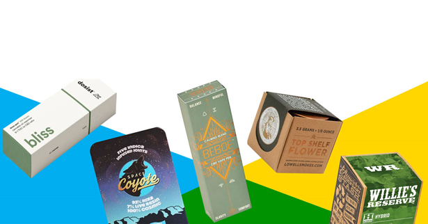
A one-of-a-kind pre-roll package does three jobs at once: it keeps the product fresh and intact, it meets your state’s child-resistance and labeling rules, and it makes a shopper pick your tube or box off a crowded dispensary shelf. The brands that stand out usually get the format and compliance right first, then build a clear visual identity on top of it. This guide walks through the formats, design choices, materials and ordering steps that make pre-roll packaging memorable without creating problems at inspection time.
If you want to see how printed tubes, boxes and multi-pack cartons look in practice before you brief a designer, a supplier catalog is a useful reference point. You can browse styles at https://stampaprints.com/pre-roll-packaging/ to compare structures, finishes and print options side by side.
Start with compliance, not artwork
Cannabis packaging in the US is regulated state by state, and the rules change often. Before any sketching, pull the current packaging and labeling regulations for every state where the product will be sold. A striking design that fails a compliance review costs far more than a plain one, because you pay for the reprint and lose shelf time.
Requirements that commonly shape a pre-roll design include:
- Child resistance: many states require packaging certified as child-resistant, typically tested to the federal protocol in 16 CFR 1700.20. Some allow a non-CR primary tube inside a CR exit bag; others require the unit package itself to be CR.
- Opacity and tamper evidence: several states require opaque packaging or a tamper-evident seal, which rules out some clear glass or clear plastic concepts.
- Universal symbol and warnings: most states mandate a specific THC symbol plus warning text at a minimum size, and that space has to be planned into the layout.
- Required data: net weight, cannabinoid content, batch or lot number, license number, harvest or packaging date and testing lab details are common.
- No appeal to minors: cartoon characters, candy-like imagery and bright toy-style graphics are restricted or banned in most markets.
A practical approach is to build a “compliance panel” into the dieline: a fixed zone for warnings, the symbol and batch data that never moves between SKUs. Everything creative happens around it. This also makes multi-state rollouts easier, because you only swap the panel instead of redesigning the whole package.
Choose the right pre-roll packaging format
The structure you pick drives cost, shelf presence and how much room you have for branding. Here is how the most common formats compare.
| Format | Best for | Branding space | Things to watch |
|---|---|---|---|
| Plastic pop-top or squeeze tube | Single pre-rolls, value lines | Small, usually a wrap label | Check CR certification and tube length (often around 98 to 116 mm) |
| Glass tube with CR cap | Premium singles, infused pre-rolls | Label or direct print | Heavier, costs more to ship, may need opaque sleeve |
| Paperboard tube | Eco-focused brands | Full wrap print | Moisture protection and CR mechanism |
| Folding carton with tray | Multi-packs (3, 5 or 7 pre-rolls) | Large, all panels | Slide-lock CR tray adds cost |
| Metal tin | Collector or limited editions | Embossed lid and sides | CR certification varies by design |
Many brands combine formats: a simple tube for single units and a printed carton that holds several tubes for multi-packs. The carton becomes the main branding canvas while the tube carries a smaller version of the same design system.
Know who you are designing for
A pre-roll aimed at experienced consumers who care about strain genetics needs different packaging than a relaxed, social product sold to occasional buyers. Before you brief a designer, write down answers to a few questions:
- What price tier is the product, and what do competing products at that tier look like on the shelf?
- Is the buyer choosing by strain, by effect (such as relaxing or energizing), by potency or by brand loyalty?
- Will most sales happen in-store behind a counter, on open shelves, or through delivery menus where a product photo is all the buyer sees?
Those answers decide how much space goes to strain names, effect cues and potency, and whether the package needs to read clearly from several feet away behind glass. If you are still defining your core buyer groups, our guide to market segmentation methods offers a structured way to split an audience by behavior and needs.
Build a visual identity that is recognizably yours
Uniqueness rarely comes from one clever graphic. It comes from a consistent system that customers learn to recognize across every SKU.
Color coding that means something
Assign colors to strain types, effects or product lines and keep them fixed. When a returning customer knows your deep green means an indica-leaning strain and your orange means a daytime blend, the package is doing sales work on its own. Keep brand colors consistent in Pantone or CMYK specs so different print runs and different materials still match.
Typography and hierarchy
On a tube with maybe two inches of visible width, hierarchy matters more than decoration. Decide the order in which a shopper should read the package (usually brand, strain name, then potency or effect) and size the type accordingly. A distinctive but readable typeface for the brand name, paired with a clean sans serif for data, holds up well at small sizes.
Mature, not childish, graphics
Because imagery that could attract minors is restricted, most standout cannabis brands lean on illustration styles such as botanical line art, geometric patterns, vintage labels or bold minimal marks. These age well, pass review more easily and look deliberate on a shelf full of loud packaging.
Use finishes and materials to add perceived value
Finishes are where a simple layout becomes a premium package. Common options include:
- Soft-touch or matte lamination for a velvety, high-end feel on cartons.
- Spot UV to make a logo or pattern shine against a matte background.
- Foil stamping in gold, silver or holographic foil for limited editions.
- Embossing or debossing that shoppers can feel, useful on tins and rigid boxes.
- Kraft or recycled paperboard for an earthy, natural look that signals sustainability.
Use one or two finishes deliberately rather than stacking all of them. A matte carton with a single foil logo often reads as more premium than a package covered in effects. Always ask the supplier for a physical sample, because finishes look very different on screen than they do in hand.
Protect freshness and the product itself
The best-looking package still fails if the pre-roll arrives dry, bent or loose. Good pre-roll packaging should:
- Fit the cone length snugly so the pre-roll does not rattle and shed material.
- Seal well enough to slow moisture loss, since dry pre-rolls burn harsh and fast.
- Block light where possible, because light exposure degrades cannabinoids and terpenes over time.
- Be easy for an adult to open once they understand the CR mechanism, with a short icon or instruction printed on the package.
Some brands add a small humidity control pack to multi-packs or glass tubes. If you do, confirm it fits the structure and does not cover required label text.
Design an unboxing moment worth sharing
For multi-packs and premium singles, the inside of the package is extra real estate. Printing the interior of a carton, adding a short brand story under the lid, or including a QR code that links to lab results and strain notes gives buyers a reason to keep and photograph the box. QR codes are especially useful because they let you share batch-specific information without crowding the outer label. The same principle applies to other custom box styles; our piece on aesthetic pillow boxes shows how structure and print can turn a simple container into part of the product experience.
Make sustainability a real feature
Cannabis packaging has a reputation for waste, and many buyers notice. Options that help include paperboard or hemp-based tubes, ocean-bound or post-consumer recycled plastic, glass that can be reused, and cartons printed with soy or water-based inks. Whatever you choose, only claim what you can back up: “recyclable” means little if the local stream does not accept the material, and vague green claims can draw regulatory attention. Specific wording, such as “tube made with 50% post-consumer recycled plastic” when that is accurate, builds more trust.
Plan budget, quantities and timelines
Custom packaging pricing depends heavily on quantity, format and finishes, so treat any figure as a starting point for quotes. Unit costs usually fall sharply as order sizes increase, which is why many new brands start with stock CR tubes plus custom labels, then move to fully printed tubes or cartons once volume is predictable. Expect minimum order quantities in the thousands for printed packaging, and plan for several weeks between artwork approval and delivery, longer if you need custom tooling or imported components.
A simple ordering sequence that avoids most expensive surprises:
- Confirm current state rules and gather CR certificates for any component you plan to use.
- Request a dieline from the supplier and design directly on it.
- Order a physical sample or prototype and test it with real pre-rolls.
- Have someone review the proof against the regulations, line by line, before approving.
- Approve a color proof, then order, keeping a buffer of stock for reprints.
Common pre-roll packaging mistakes to avoid
- Designing on a mockup and discovering the compliance panel does not fit the real label size.
- Using tiny, light-colored type for potency and strain names that shoppers cannot read behind a counter.
- Changing colors and fonts with every new SKU so the brand never becomes recognizable.
- Ordering a huge first run before testing how the package performs with real customers.
- Forgetting how the package photographs for online menus, where many buyers first see it.
Strong packaging supports the rest of your marketing, so it helps to plan it alongside your wider promotion. Our guide to digital marketing for small businesses covers how to carry the same identity into your website and social channels, and our design ideas for one-of-a-kind Jeep ducks is a fun example of how small custom touches make an item memorable. For more guides like this, browse the Business category.
This article is general information, not legal advice. Cannabis packaging rules vary by state and change often, so confirm requirements with your state regulator or a compliance professional.
Frequently asked questions
Does pre-roll packaging have to be child-resistant?
In most US adult-use markets, yes, either the pre-roll package itself or the exit bag must be child-resistant. The exact requirement depends on the state, so check current regulations before ordering.
What size tube do I need for a pre-roll?
Match the tube to your cone length. Many common tubes run from about 98 mm to 116 mm or longer, and a snug fit keeps the pre-roll from shifting and shedding material.
How can a small brand make its packaging stand out on a budget?
Start with certified stock tubes and invest in a strong custom label with a consistent color system, clear typography and one signature finish. Upgrade to fully printed tubes or cartons once sales volume justifies higher order quantities.
Is sustainable pre-roll packaging worth it?
It can be, especially for brands whose buyers care about waste. Paperboard, hemp-based and recycled-content options exist, but make sure the material still meets child-resistance rules and only make environmental claims you can support.
What information usually has to appear on a pre-roll label?
Common requirements include the universal THC symbol, warnings, net weight, cannabinoid content, batch or lot number, license number and dates. Each state sets its own list and minimum sizes.